
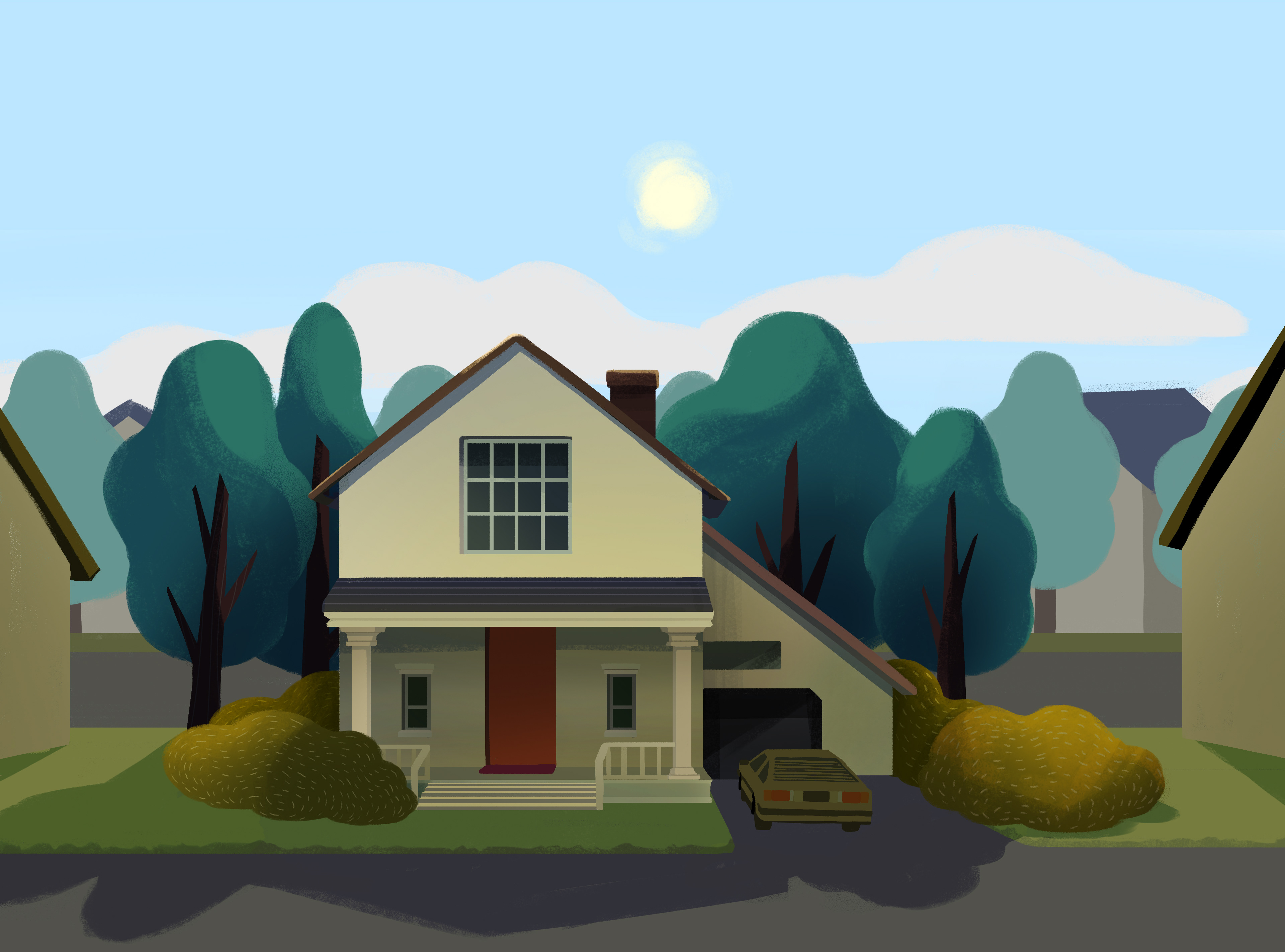
"P" FOR PERSPECTIVE IS PAIN
Truthfully, if I could have worked with a partner on this project, I would have GLADLY handed over the background art aspect of the project.
Painting backgrounds can be fun. No, really, it is fun.
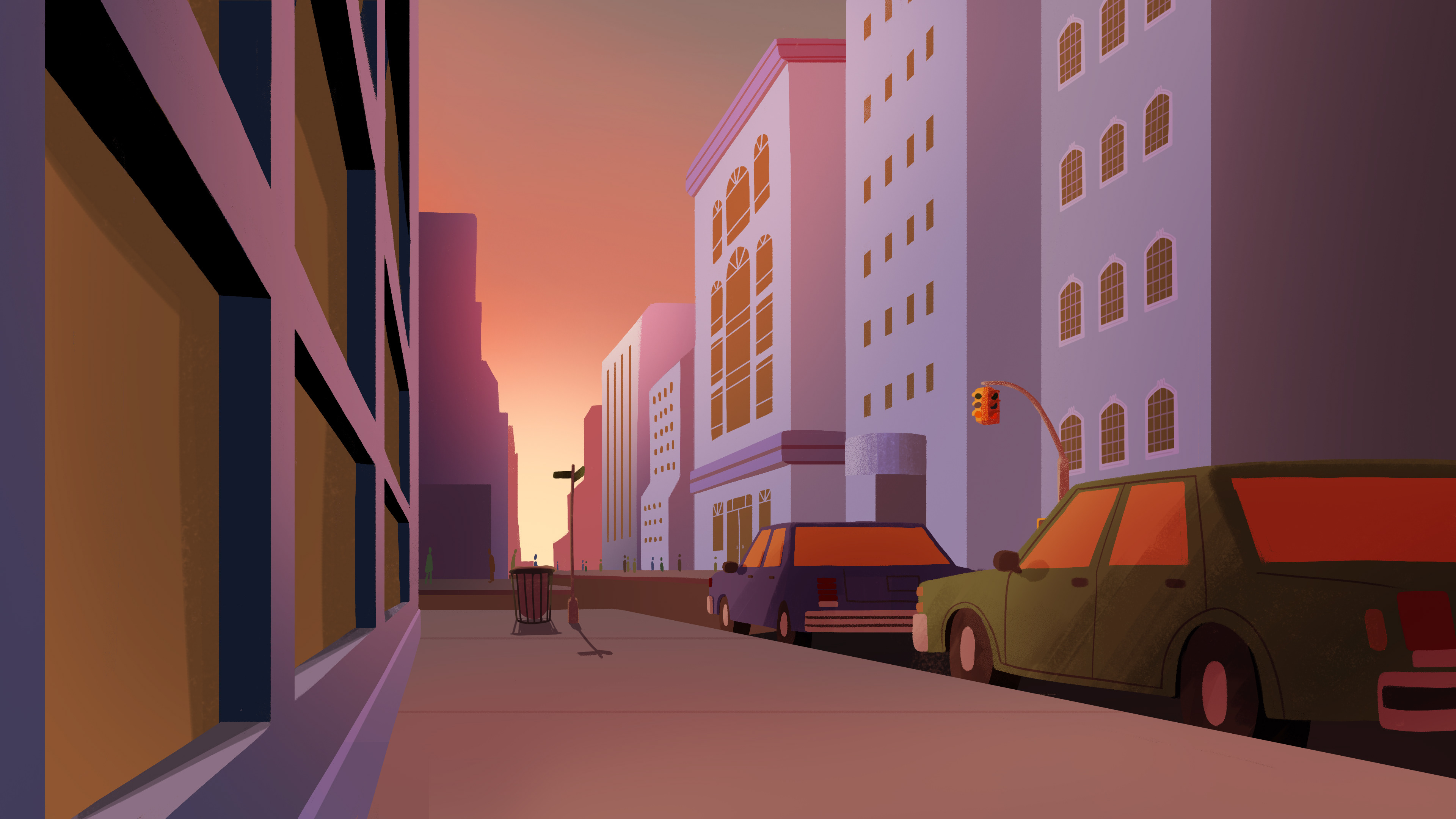
I just don’t want to make 10 different paintings of the same environment with a SLIIIIIIIGHTLY different angle. Indeed. this painful reality is truly the only regretful thing about working in 2D despite the gloriously generous room for stylization. Every shift in perspective is a whole new drawing.
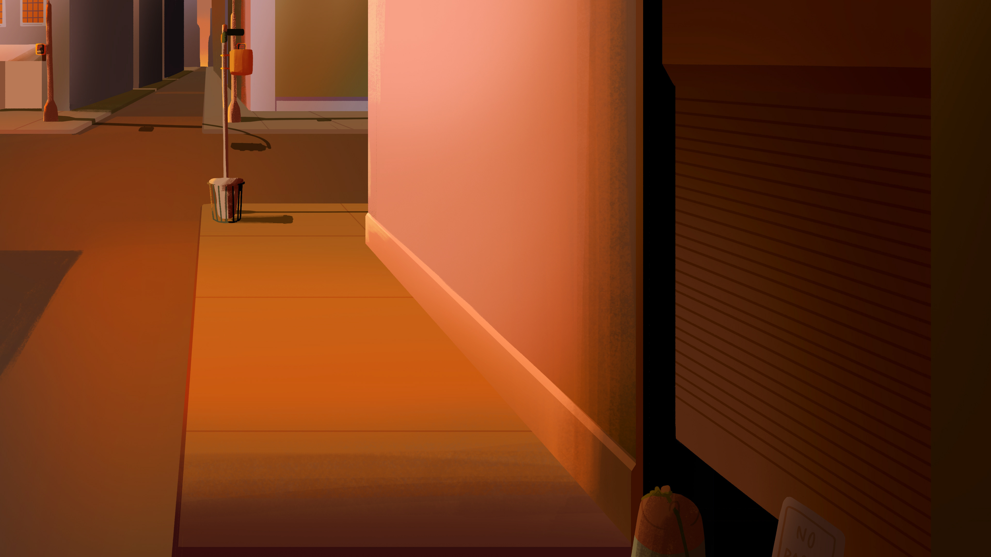
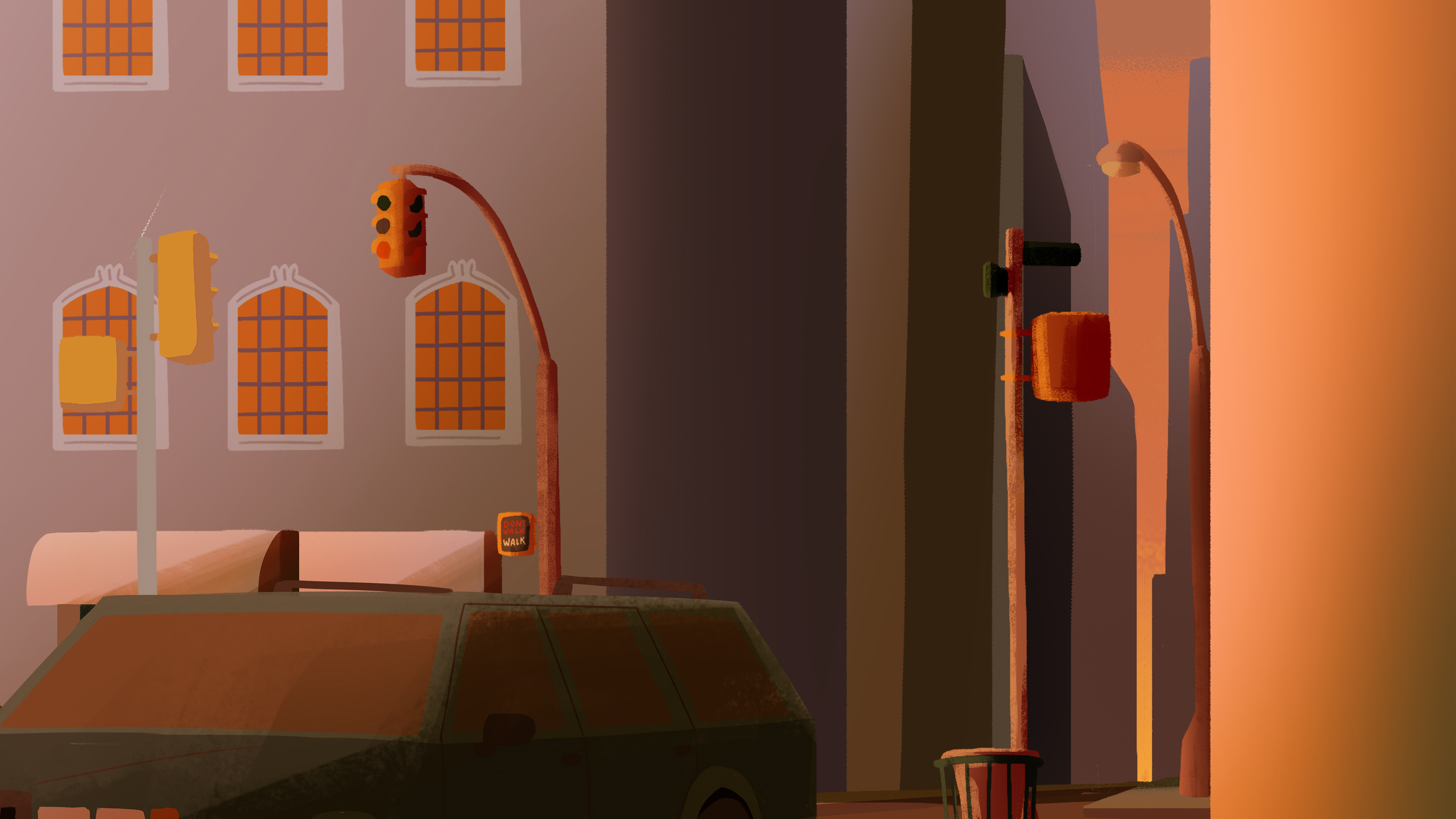

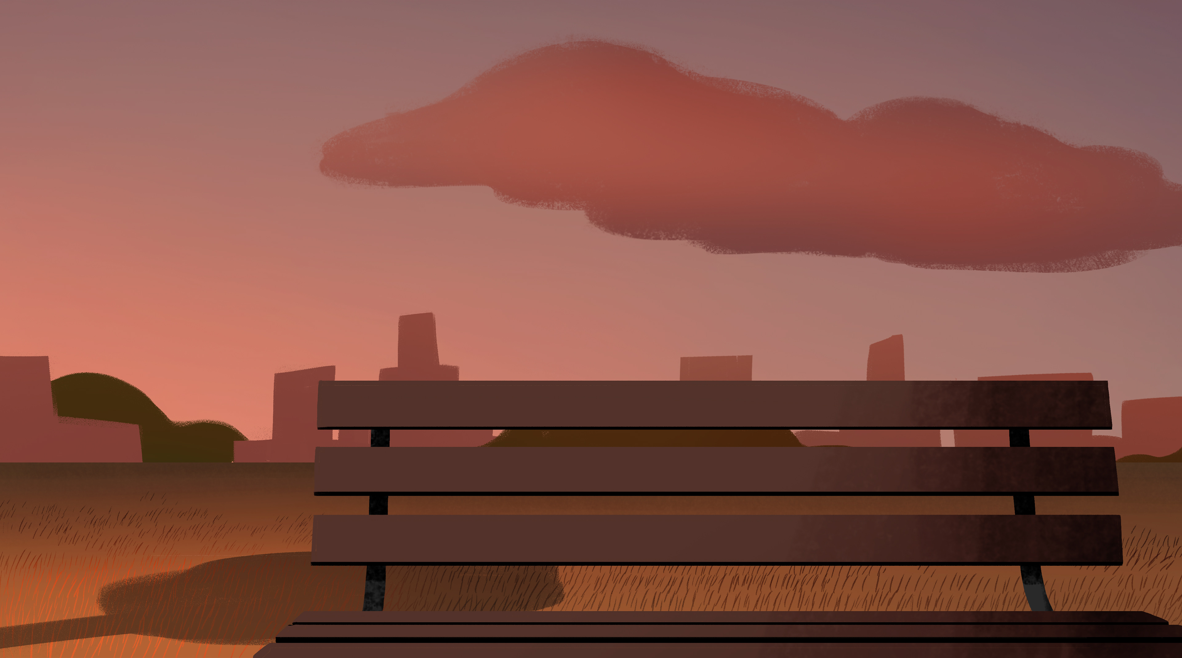
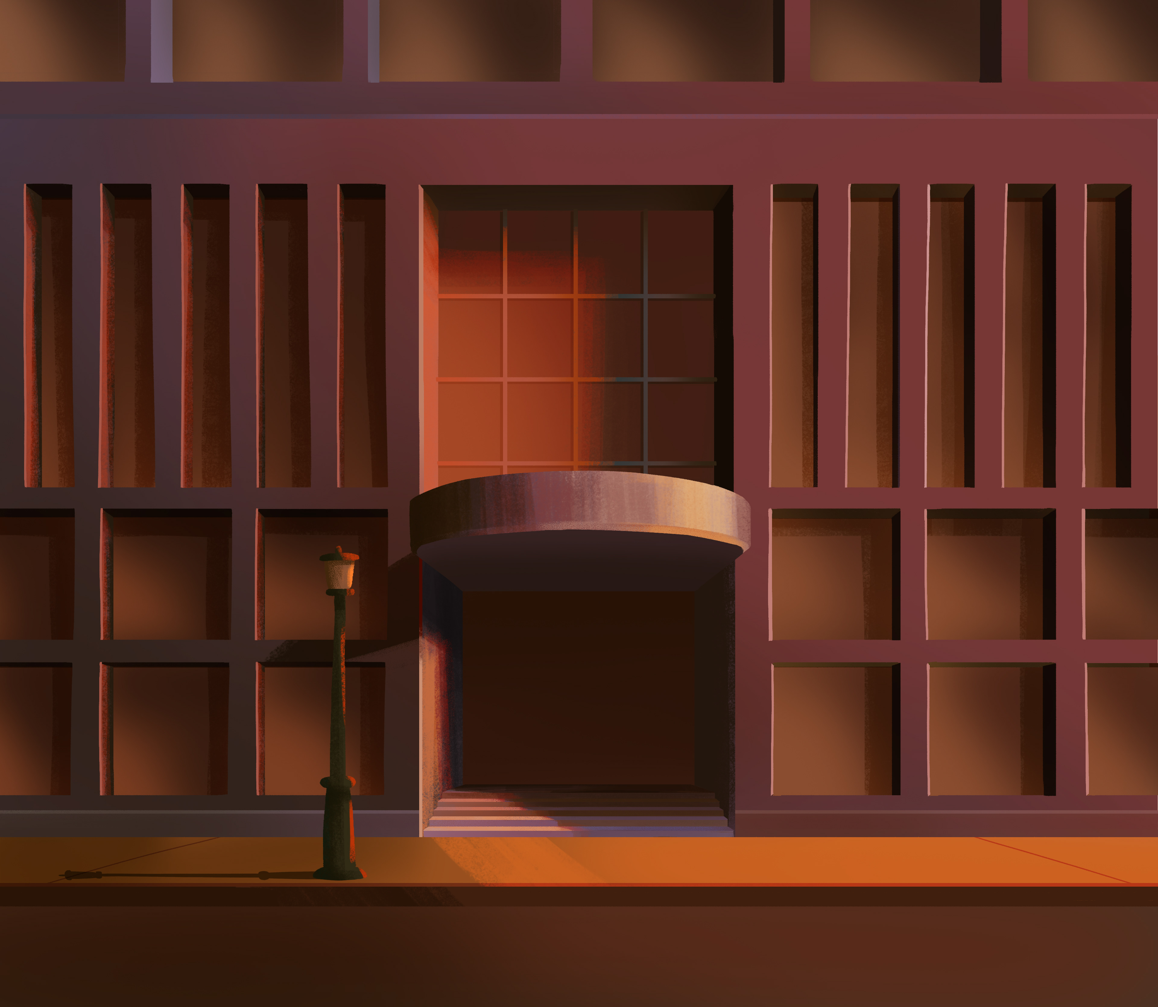
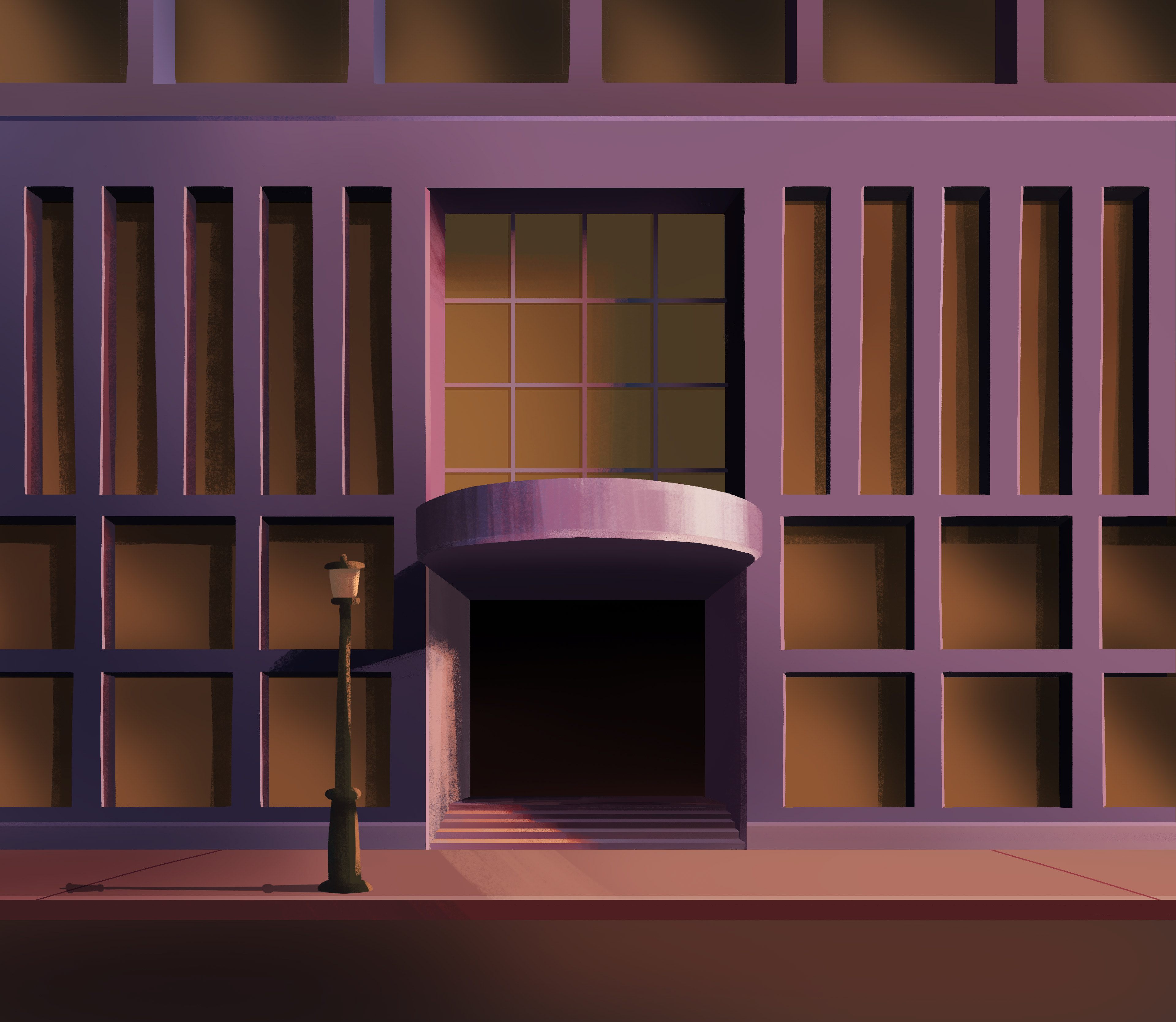
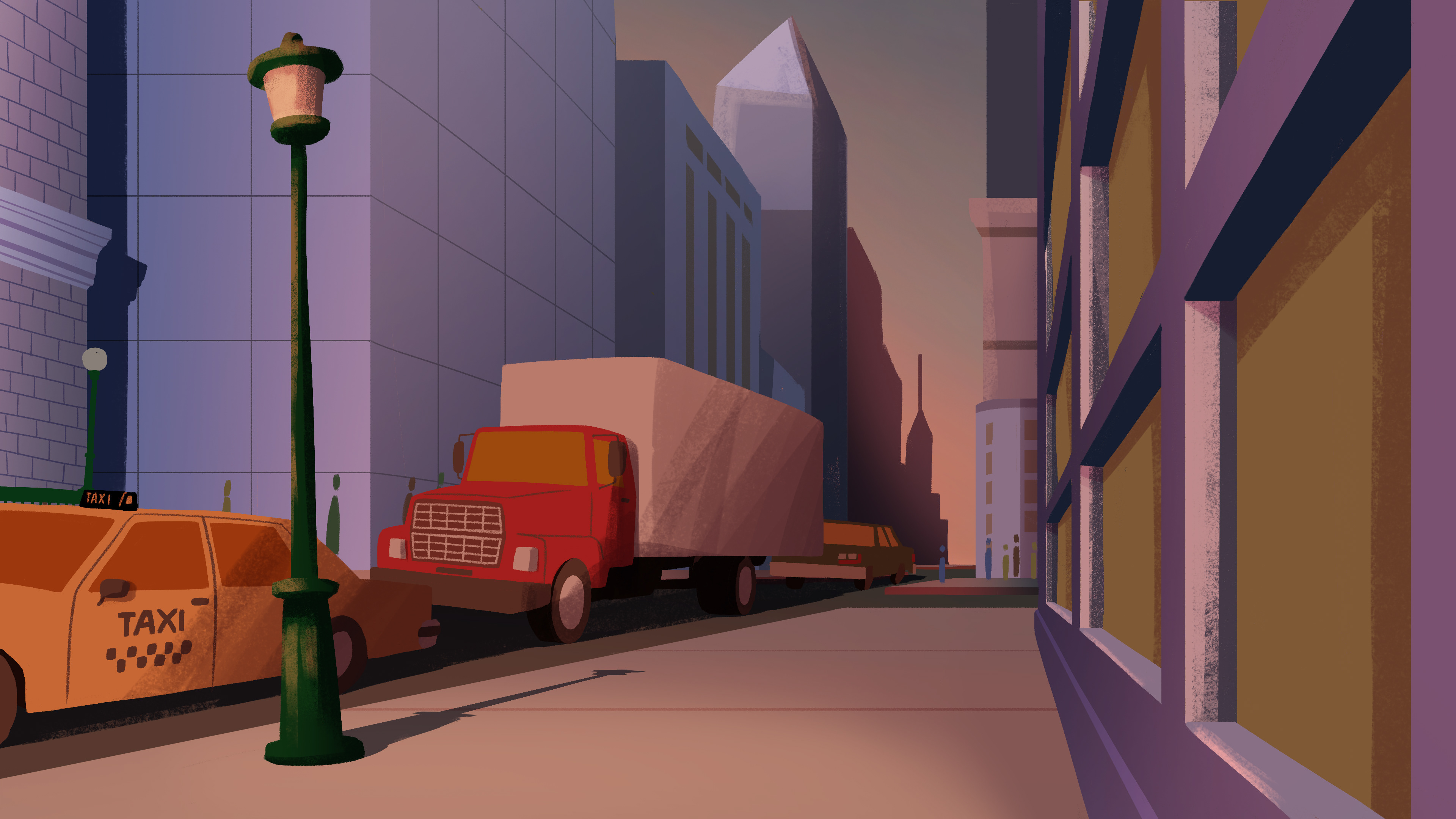
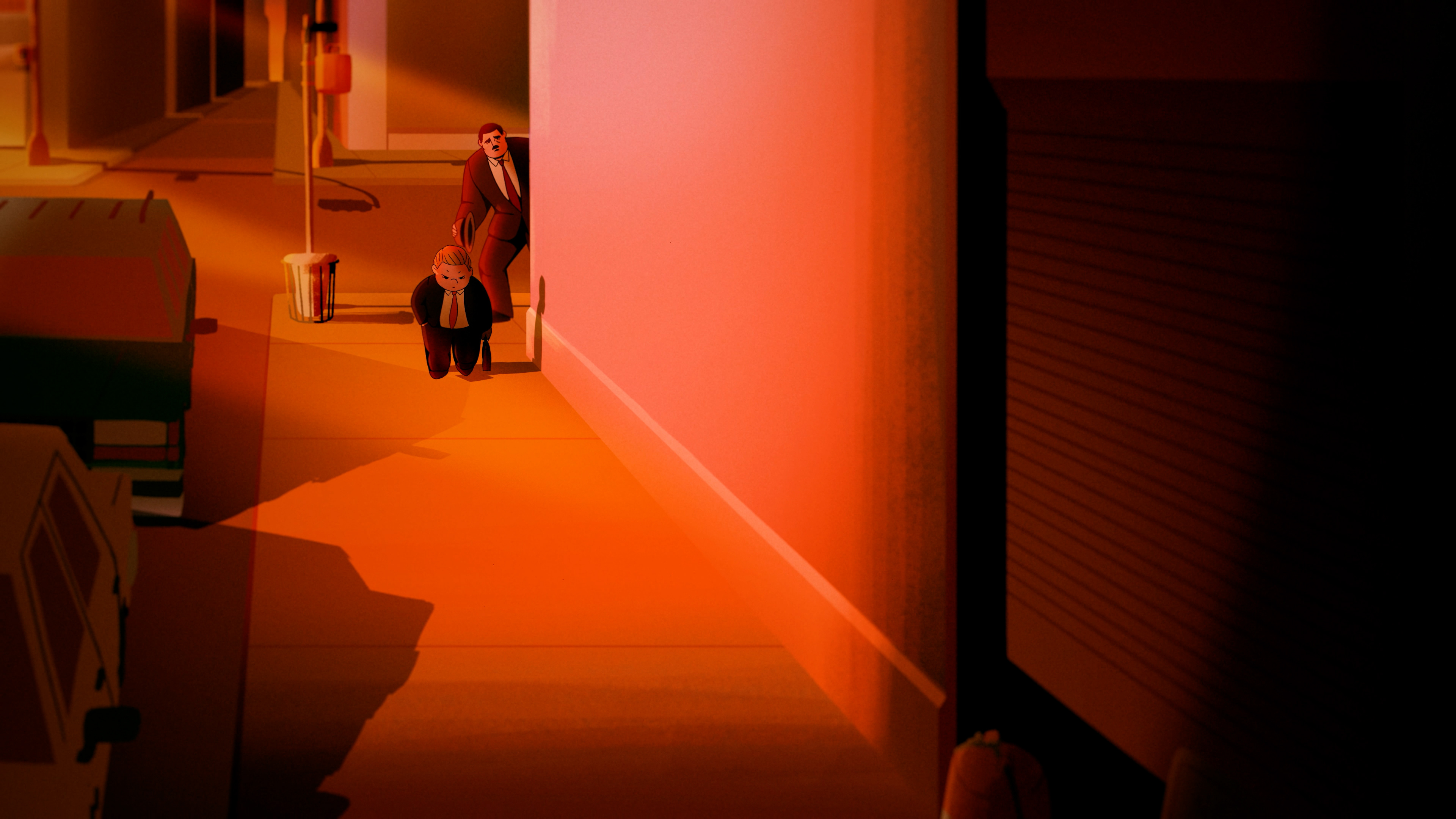
The second scene when Nick first runs into Frank and the fourth scene when we see after Nick in the city again are direct echo of one another. The scenes take place in the same location with identical opening shots. However, as though to hint at Nick's emotional transition during this scene, the lighting is slightly softer with a sweeter tint of pink than vindictive orange.
WORK SMARTER, NOT HARDER
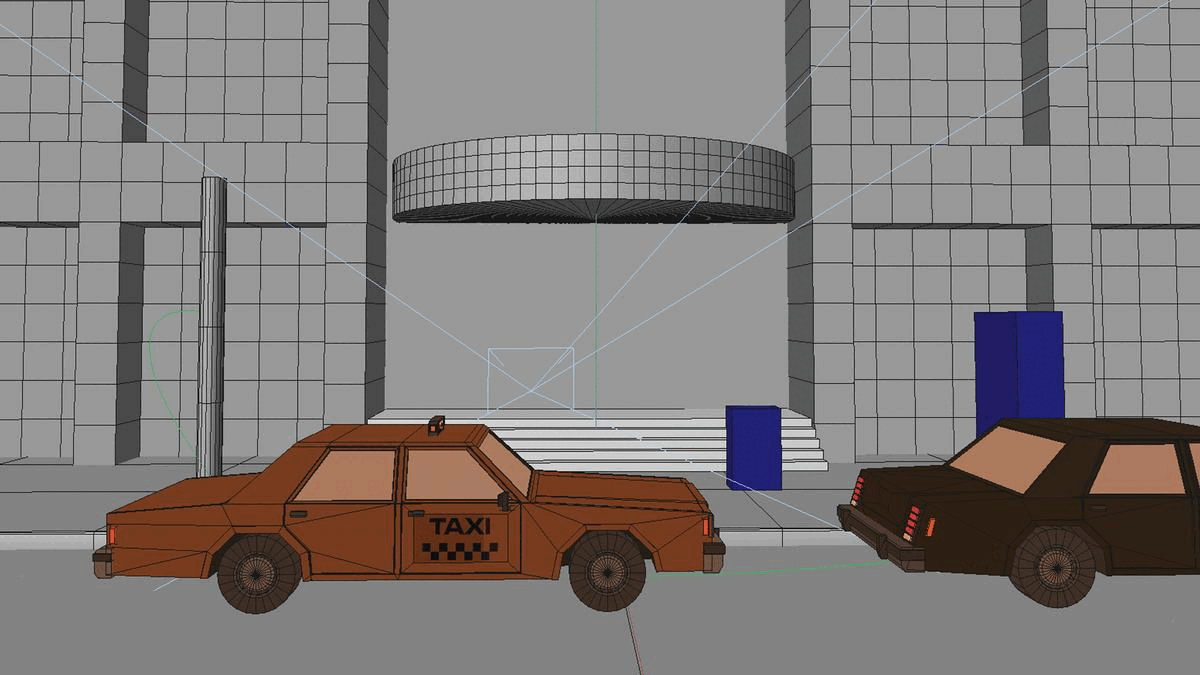
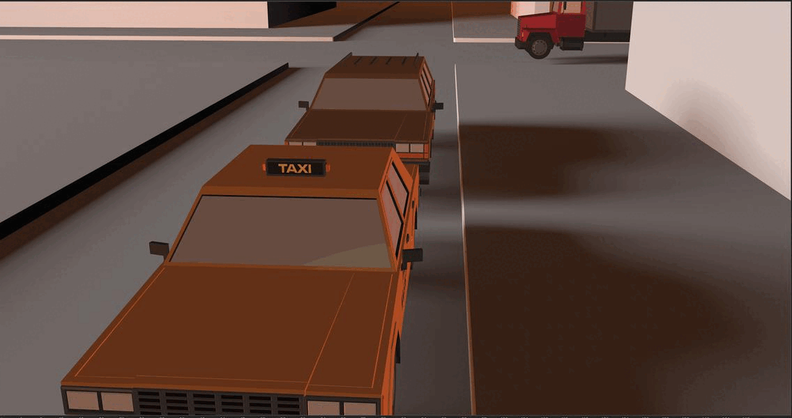
Up until this project, my purist ass somehow thought using 3D models as a reference was “cheating.” Also, a part of me thought it would look too “perfect” compared to the rest of my drawings. But as I found myself using meticulous grids and re-drawing again and again until I got the perspective just right, I realized how much more time I could be saving if I just traced over a 3D model that is already pretty stylized. Besides, it’s my line work with which I trace the model as well as my creative decision to what details to leave out or include that make the drawing look like they belong in the same world as all my other drawings.
With that, I went on CG trader and found a 3D model set of eighties cars that were most similar to my visual style. As well as a 3D model of a DeLorean. It also turned out that most of my shots in scenes that take place in the city street don’t have any significant car movements so I was able to get away with drawing the cars in Photoshop and keyframing them in AfterEffects without having to shift perspectives.
The only shot that actually required more attention was the shot where Nick’s DeLorean takes off as it transitions into a flashback sequence. You can find the details HERE.
IMITATING AND REMIXING
Another silly "sin" I used to be hyper-cautious of was using other artists' works as a reference. This resistance had two folds: 1) I thought it was equivalent to plagiarizing, and 2) my pride refused to accept the idea I wasn't original. When, in fact, not knowing how to use references to expand and enrich your visual language is probably the most telling of all rookie mistakes.
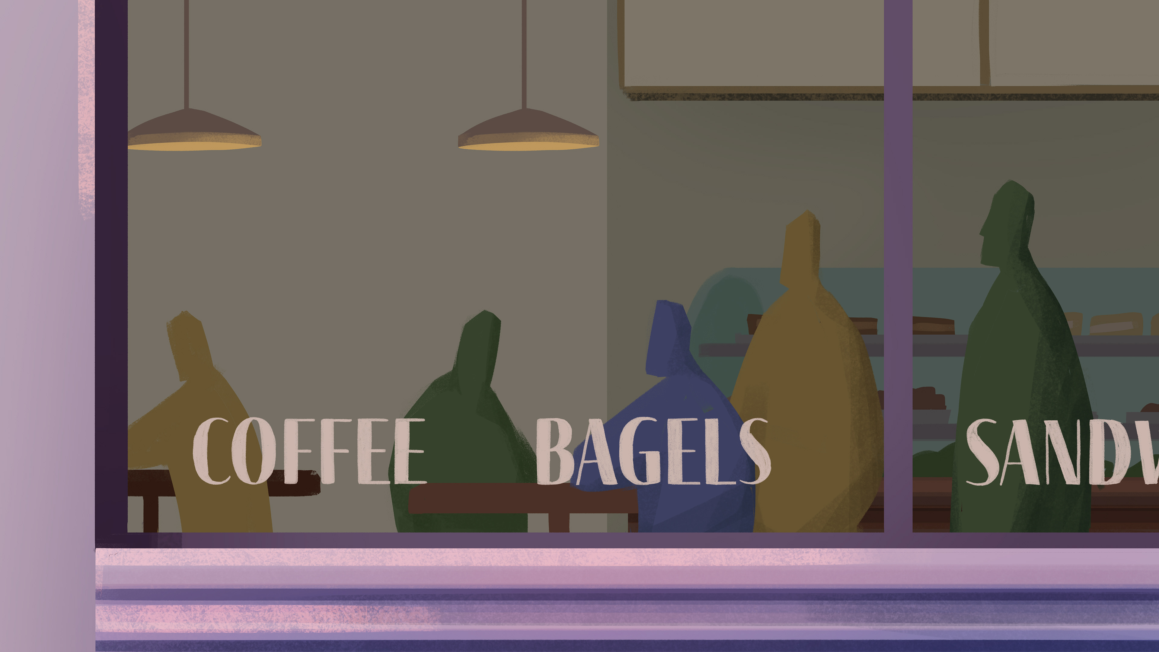
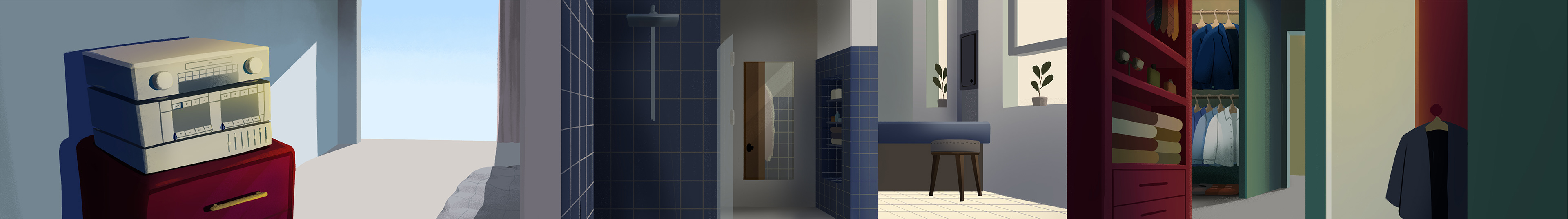
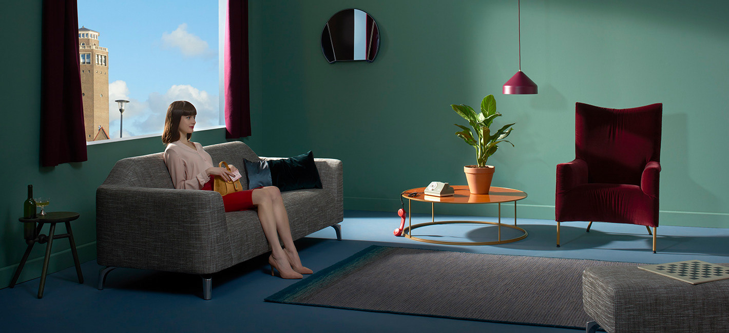
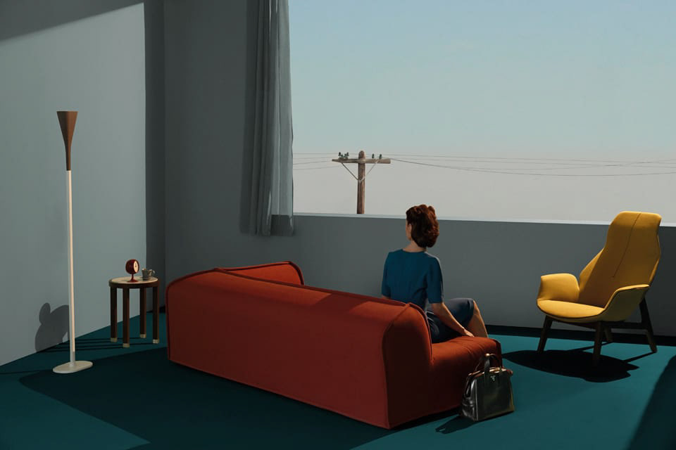
Thankfully, for this project, I was eager to get help from masters who have already successfully captured the mood I was after. The backgrounds for the opening scene was essentially a tapestry of references I took from multiple artists, ranging from paintings and films to commercial photoshoots.
Darek Grabus, "Return To the Sea"
American Psycho (2001)
Catalogue image from Kok Wooncenter
Giovanni Gastel, Ritratti di living, Elle Decor April 2013
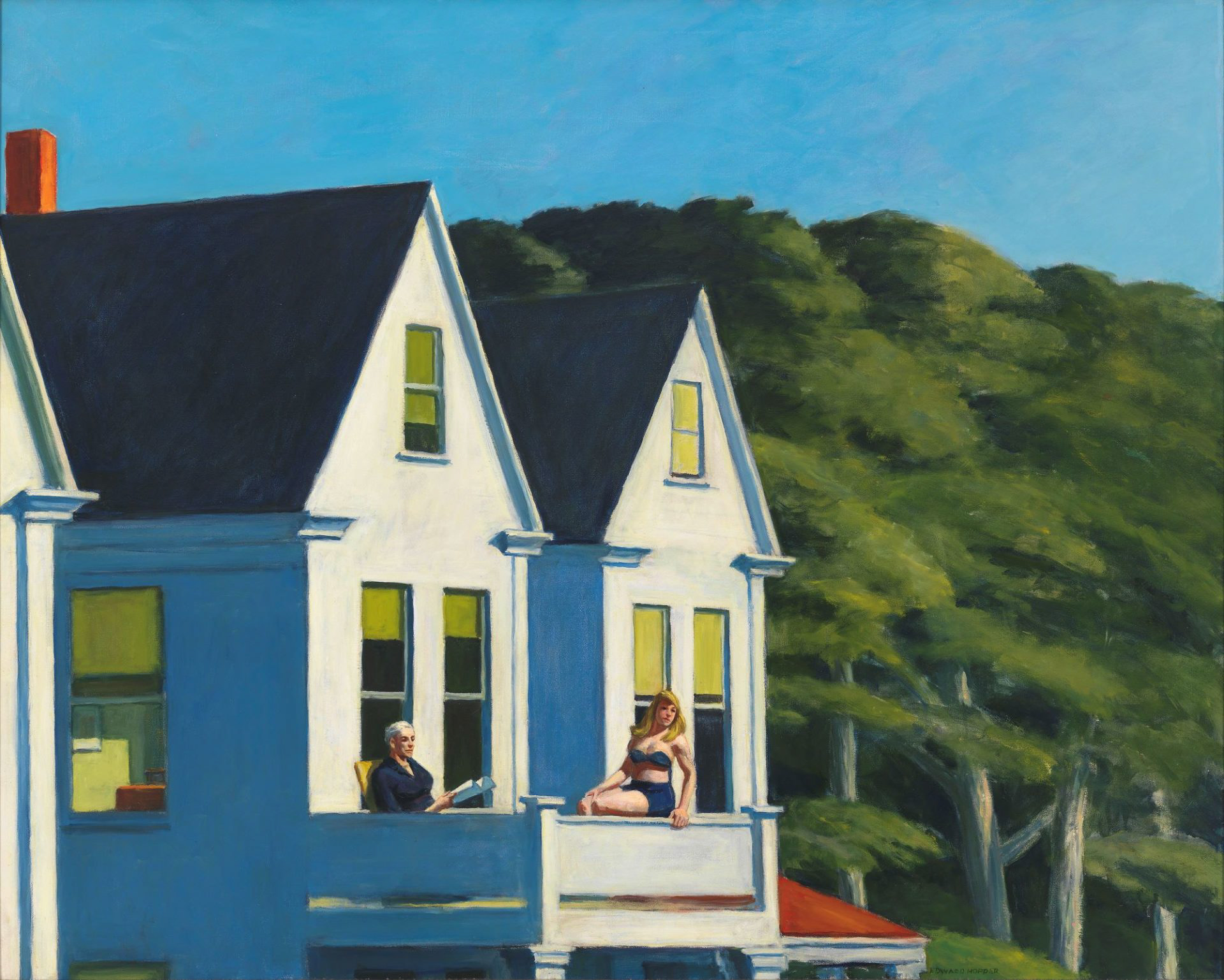
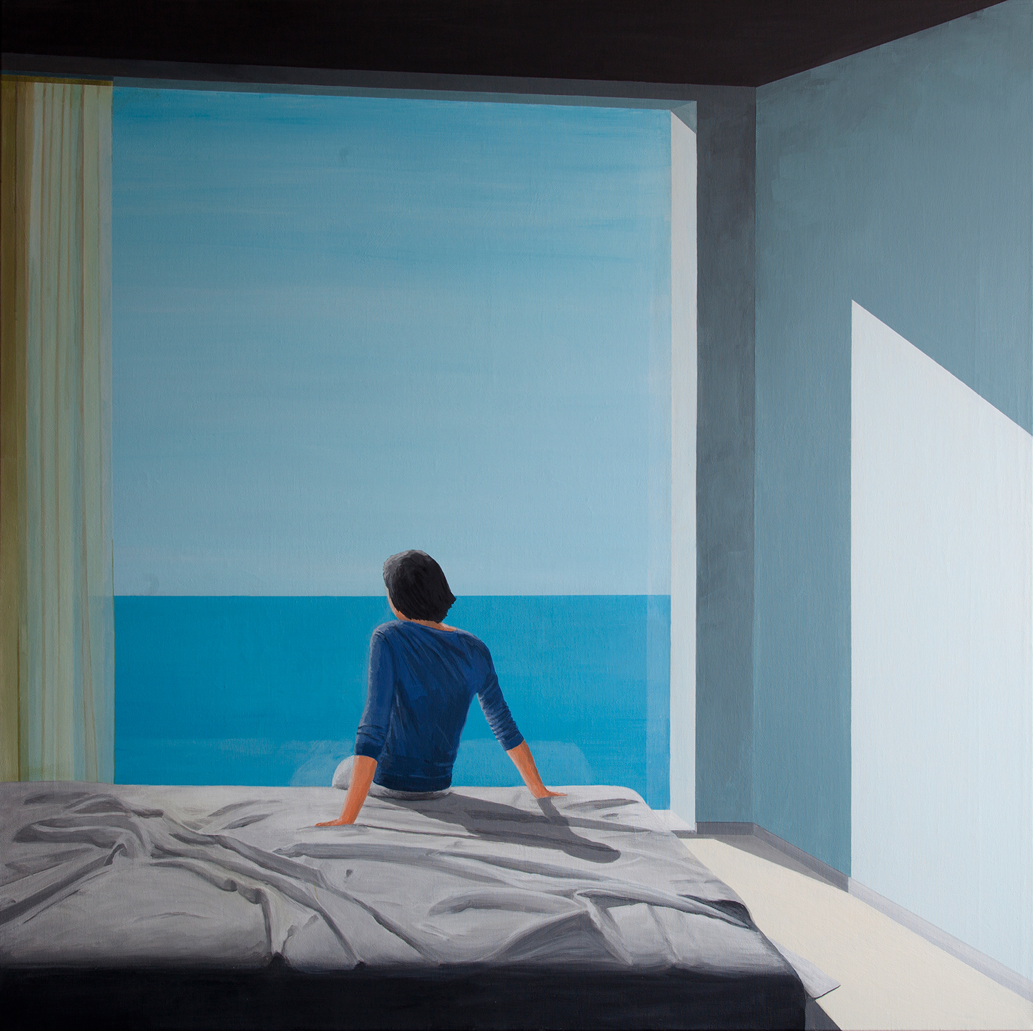
Edward Hopper, "Second Story Sunlight" (1960)
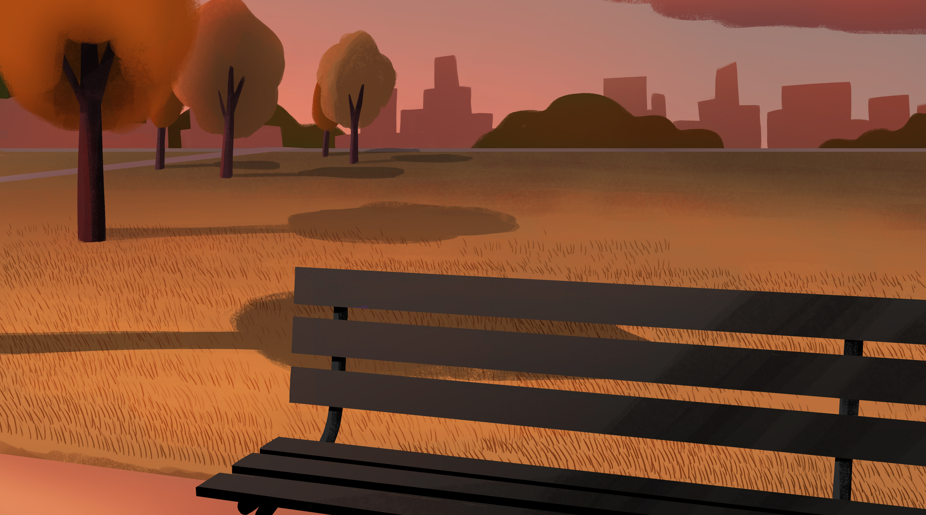
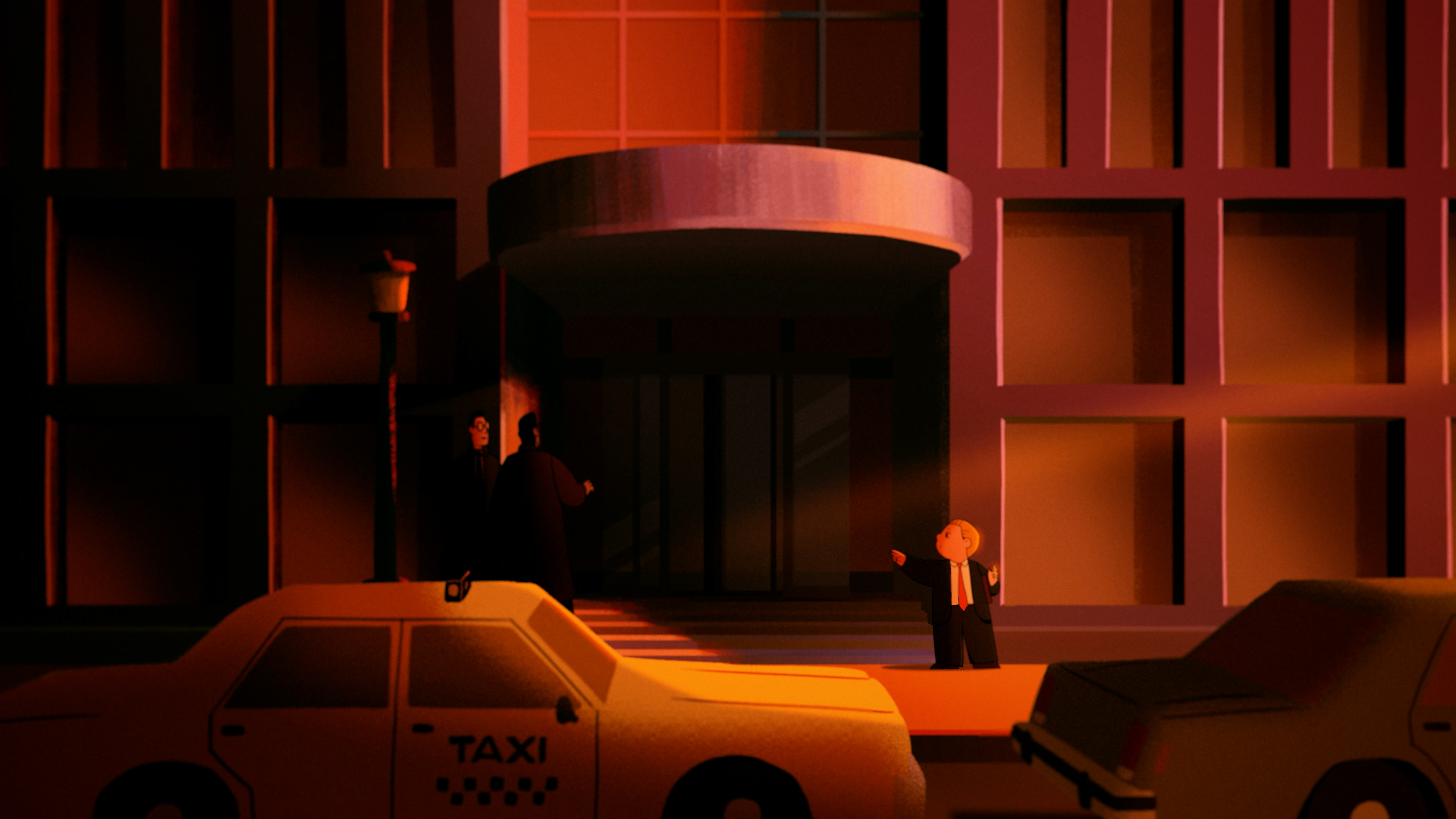
My character animation took #1 in my priority. After all, without my characters, there is no story. Without GOOD, BELIEVABLE character acting, the story loses its impact. I am glad I prioritized the quality of my character animation to the best of my ability. But this also delayed everything else, which led to working on my backgrounds until the very day of my submission – inducing an anxiety-fueled adrenaline rush that aged me at least 10 years. You win some, you lose some.